
For those who aren’t sure how to change the colors, and would like something easier on your eyes. There will be two sets of CSS, because I have a low and a high contrast that I use. This is also so that you are able to adjust colors on your own, instead of hoping to find a suitable skin among the public ones.
Everything is under the cut because it is a long post and there are a lot of images. I’m sorry people on mobile.
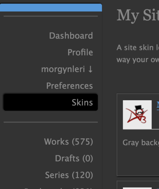
You will want to go to skins. Since I have a sidebar, and the other configuration frustrates me, that’s what you see. Should be under preferences, either way.
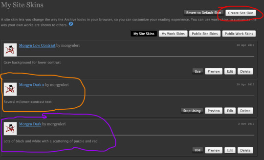
Click through for a larger image – the button circled in red is where you go to make a skin – Create Site Skin. There are also public site skins – it’s in the second row of buttons, second from the right.
The one I’m using in the caps is the one circled in orange – Morgyn Dark 2 – and the higher contrast one is the one circled in purple – Morgyn Dark. I also have a lighter low contrast one – Morgyn Low Contrast – it is uncircled.
… and I just realized that the Morgyn Dark is a mess, and needs fixed before I share it. I’ll provide the Morgyn Dark 2, and how to adjust it for higher constrast.

When you open up create skin, there are two things in the first box that you need to enter, underlined here in red – type (site or work) and title (name it!)
The second box is CSS, circled in orange. Text wall coming up, this is CSS to copy-paste. Anything in bold is where you change colors. Ones that are “background” are as they say, background colors (the dark grays in my screen caps), the ones that say “color” are text (which is a lowish contrast on mine because high contrast makes my sight blur faster).
You may notice I’ve failed to actually remember to change all my buttons to dark w/light text. I think they did weird things when I tried last time. That might have been a glitch that got fixed, but I’ve been using this for years now.
Morgyn Dark 2:
#outer .region,
#footer .group,
.post fieldset fieldset,
fieldset fieldset {
background: none;
}
body,
.group,
.group .group,
.region,
.flash,
fieldset,
fieldset fieldset ul,
form dl,
textarea,
#main .verbose legend,
.verbose fieldset,
.notice,
ul.notes,
input,
textarea,
table,
th,
td:hover,
tr:hover,
.symbol .question:hover,
#modal,
.ui-sortable li,
.required .autocomplete,
.autocomplete .notice,
.system .intro,
.comment_error {
background: #333;
color: #888;
border-color: #222;
outline: #111;
box-shadow: none;
}
div.dynamic,
.dynamic form {
background: #333;
color: #888;
border-color: #222;
outline: #111;
box-shadow: none;
}
#header .actions a:hover,
#header .actions a:focus,
#header .dropdown:hover a,
#header .open a,
#header .menu,
#small_login,
#header .dropdown:hover .current + .menu,
.group.listbox,
fieldset fieldset.listbox,
form blockquote.userstuff,
input:focus,
textarea:focus,
li.relationships a,
.group.listbox .index,
.dashboard fieldset fieldset.listbox .index,
#dashboard a:hover,
th,
.secondary,
.thread .even,
.system .tweet_list li {
background: #2a2a2a;
}
#header .dropdown .menu a:hover,
#header .dropdown .menu a:focus,
.splash .favorite li:nth-of-type(odd) a {
background: #111;
}
.statistics .index li:nth-of-type(even) {
background: #333;
}
#header ul.primary,
#outer #footer,
.toggled form {
background: url(“/images/skins/textures/tiles/black-noise.jpg”);
}
#header ul.primary,
#footer,
#dashboard ul,
dl.meta,
.group.listbox,
fieldset fieldset.listbox,
#main li.blurb,
form blockquote.userstuff,
div.comment,
li.comment,
.toggled form,
form dl dt,
#inner .module .heading,
.bookmark .status span,
.splash .news li {
border-color: #555;
}
.group.listbox,
fieldset fieldset.listbox,
#main li.blurb,
.wrapper,
.secondary,
form blockquote.userstuff,
.thread .comment,
.toggled form {
box-shadow: 1px 1px 3px #000;
}
#dashboard .current,
.actions a:active,
#outer .current,
a.current,
.current a:visited,
span.unread,
.replied,
span.claimed,
dl.index dd,
.own,
.draft,
.draft .unread,
.child,
.unwrangled,
.unreviewed,
.ui-sortable li:hover {
background: #000;
border-color: #555;
box-shadow: -1px -1px 3px #000;
}
input,
textarea {
box-shadow: inset 0 1px 2px #000;
}
li.blurb,
.blurb .blurb,
.listbox .index,
fieldset fieldset.listbox,
.dashboard .listbox .index {
box-shadow: inset 1px 1px 3px #000;
}
#footer a:hover,
#footer a:focus,
.autocomplete .dropdown ul li:hover,
li.selected,
a.tag:hover,
.listbox .heading a.tag:visited:hover,
.symbol .question,
.qtip-content {
background: #5998D6;
color: #111;
}
.splash .favorite li:nth-of-type(odd) a:hover,
.splash .favorite li:nth-of-type(odd) a:focus {
background: #5998D6;
color: #111;
}
#header #greeting img,
#header .heading a,
#header .heading a:visited,
#header .user a:hover,
#header .user a:focus,
#header .user .current,
#header fieldset,
#header form,
#header p,
#dashboard a:hover,
.actions a:hover,
.actions input:hover,
.delete a,
span.delete,
span.unread,
.replied,
span.claimed,
.draggable,
.droppable,
span.requested,
a.work,
.blurb h4 a:link,
.blurb h4 img,
.splash .module h3,
.splash .browse li a:before,
.required,
.error,
.comment_error,
a.cloud7,
a.cloud8,
#footer .actions .secondary a {
color: #5998D6;
}
#greeting .icon,
#dashboard.own,
.error,
.comment_error,
.LV_invalid,
.LV_invalid_field,
input.LV_invalid_field:hover,
input.LV_invalid_field:active,
textarea.LV_invalid_field:hover,
textarea.LV_invalid_field:active,
#header .actions .current,
.qtip-content {
border-color: #5998D6;
}
a,
a:link,
a.tag,
#header a,
#header a:visited,
#header .current,
#header .primary .open a,
#header .primary .dropdown:hover a,
#header .primary .dropdown a:focus,
#dashboard a,
#dashboard .current,
.heading,
.group .heading,
.filters dt a:hover {
color: #888;
}
a:visited,
.actions a:visited,
.listbox .heading a:visited {
color: #999;
}
.actions a,
.action,
.actions input,
input[type=“submit”],
button,
.current,
.actions label,
#header .actions a,
#header input[type=“submit”],
#header .search input[type=“text”] {
background: #555;
border-color: #222;
color: #eee;
box-shadow: inset 0 -8px 4px #232323, inset 0 8px 7px #555;
text-shadow: none;
}
.actions a:hover,
.actions input:hover,
#dashboard a:hover,
#header .search input[type=“text”]:hover,
#header .search input[type=“submit”]:hover,
.actions a:focus,
.actions input:focus,
#dashboard a:focus,
#header .search input[type=“text”]:focus,
#header .search input[type=“submit”]:focus {
color: #999;
border-color: #AAA;
box-shadow: inset 2px 2px 2px #888;
}
.actions a:active,
.current,
a.current,
.current a:visited {
color: #fff;
background: #555;
border-color: #888;
box-shadow: inset 1px 1px 3px #333;
}
.delete a,
span.delete {
box-shadow: -1px -1px 2px rgba(255,255,255.25);
}
ul.required-tags,
.bookmark .status span,
.blurb .icon {
opacity: 0.9;
border: 0;
}
#outer .group .heading,
#header .actions a,
#footer .secondary a,
fieldset.listbox .heading,
.userstuff .heading,
.heading,
.userstuff h2 {
text-shadow: none;
color: #888;
background: none;
}
#header .actions a,
fieldset fieldset,
.mce-container button {
box-shadow: none;
}
fieldset fieldset.listbox {
outline: none;
}
.mce-container input:focus {
background: #F3EFEC;
}

Once things are in the CSS box, the next one is advanced. Show the box, you should get this:

The what it does: replace archive skin entirely. That is the option you want. The rest of the options you can ignore.

Final button! And then you should be able to preview and use the skin.
If you’re looking for readily available site skins for similar effects, I used Reversi as the base for this, which is a public site skin, readily snaggable off the list of site skins. Those bolded places, though, are still where you look for changing colors. Experiment with it to get what you’re looking for. And I hope that it doesn’t do weird and entertaining things, which I’ve had to deal with while trying to make skins work.
 There's a Mirror on the Wall